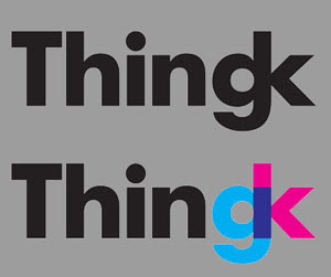

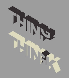
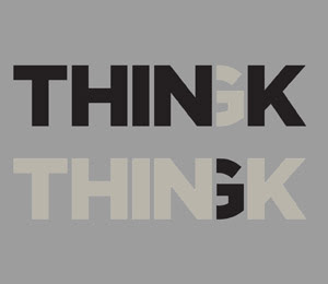
The only drawback was the lack of an icon or a pictogram. After several retries, we noticed that the "gk" combination in the first draft resembled a stylized stick man. Better yet, a men with a club (Do you remember our manifesto? We are the new men with the club, and our club is irony).At that point we blended in the "thin" theme, and obtained this:
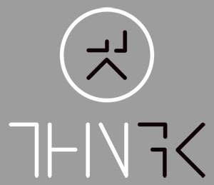
The letter are only half-drawn, to highlight the fact that the name is a half and half combination of "thing" and "think".
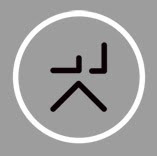
To really resemble a men, though, we were still missing a head. No sooner said than done:

What's more, the logotype resembles a bunch of PCB tracks. That is soo geek, and we love that ;)

No comments:
Post a Comment