One of the most ancient forms of spirituality is animism. The tenet of animism is that, in addition to all living beings, also objects and natural phenomena have a soul, a vital principle. Even if modern science has completely disproved any foundation for animism, the majority of people “believes”, even though at a subconscious level. There are people who talk to their car, or with their computer. There are people who assign to objects a will of their own, saying, for example, “my radio doesn’t want to tune in on that station”. People expect objects, at least the more complicated ones, to behave in an “intelligent” manner, or at least “intelligible”; they compare objects to pets: a dog’s behavior, for example, may be puzzling at times, but most of the times we can understand the reasons behind its actions.
Modern technology has exasperated this, but at the same time pushing it to the back of our brains: a few decades ago a phone was only a kind of “voice pipe”, whereas now we expect to be able to use one to play, write, draw… and speak, if we must.
All this to say that, just maybe, we expect a clock to do something more than tell the time. To have some “smart” function, a kind of thought process. To interact with its environment…
Inspired by Rob Faludi
Monday, October 17, 2011
Saturday, October 8, 2011
And now, our logo
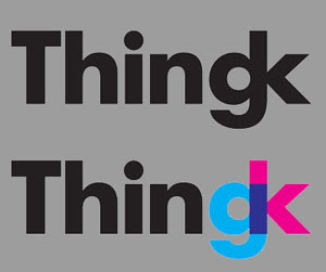
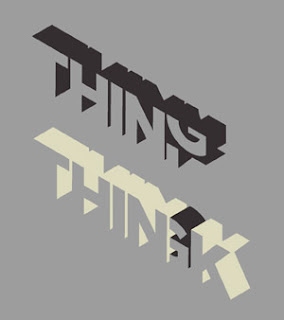
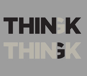
While waiting to present the first details about our products, I'm going to finish the story of our name and logo, started in the previous post.We wanted a logo that would draw attention to the fact that our name is the union of two words, "thing" and "think", so we tried to highlight the end of the name, the two letters gk. Here are some drafts:

The only drawback was the lack of an icon or a pictogram. After several retries, we noticed that the "gk" combination in the first draft resembled a stylized stick man. Better yet, a men with a club (Do you remember our manifesto? We are the new men with the club, and our club is irony).At that point we blended in the "thin" theme, and obtained this:
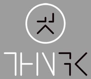
The letter are only half-drawn, to highlight the fact that the name is a half and half combination of "thing" and "think".

To really resemble a men, though, we were still missing a head. No sooner said than done:

What's more, the logotype resembles a bunch of PCB tracks. That is soo geek, and we love that ;)


The only drawback was the lack of an icon or a pictogram. After several retries, we noticed that the "gk" combination in the first draft resembled a stylized stick man. Better yet, a men with a club (Do you remember our manifesto? We are the new men with the club, and our club is irony).At that point we blended in the "thin" theme, and obtained this:

The letter are only half-drawn, to highlight the fact that the name is a half and half combination of "thing" and "think".

To really resemble a men, though, we were still missing a head. No sooner said than done:

What's more, the logotype resembles a bunch of PCB tracks. That is soo geek, and we love that ;)

Subscribe to:
Comments (Atom)